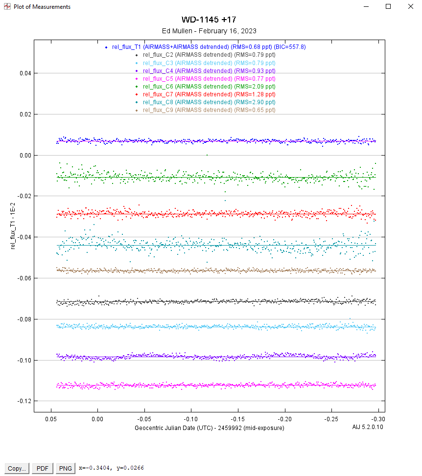
I am analyzing a star with transits that are unpredictable and often very subtle. I want to take advantage of the "Fit Optimization" functions available on the "Data Set 2 Fit Settings" screen to get the best information for T1. The way I can do that is to select a curved transit fit on the "Fit Mode" of the "Multi-Plot Y Data" screen. Then when the "Data Set 2 Fit Settings" screen comes up I de-select "Enable Transit" box.
So far, so good. The only issue I have is that by doing the above, the "Plot of Measurements" screen puts a horizontal line through the T1 data (almost as if it intends to fit the T1 data to a straight line). Of course I do not want any fitting done on T1. And for some reason the line it puts through the T1 data is pink whereas the dots are blue. I have no idea why it does that. Please see the attached screen print to see what I am looking at.
Is there any way to get rid of the line going through the T1 data on the Plot, and could you confirm that no fitting is being done on the T1 data? Thanks!
Ed
